Description
An Imaginary Landscape Between Water, Sky and Dream
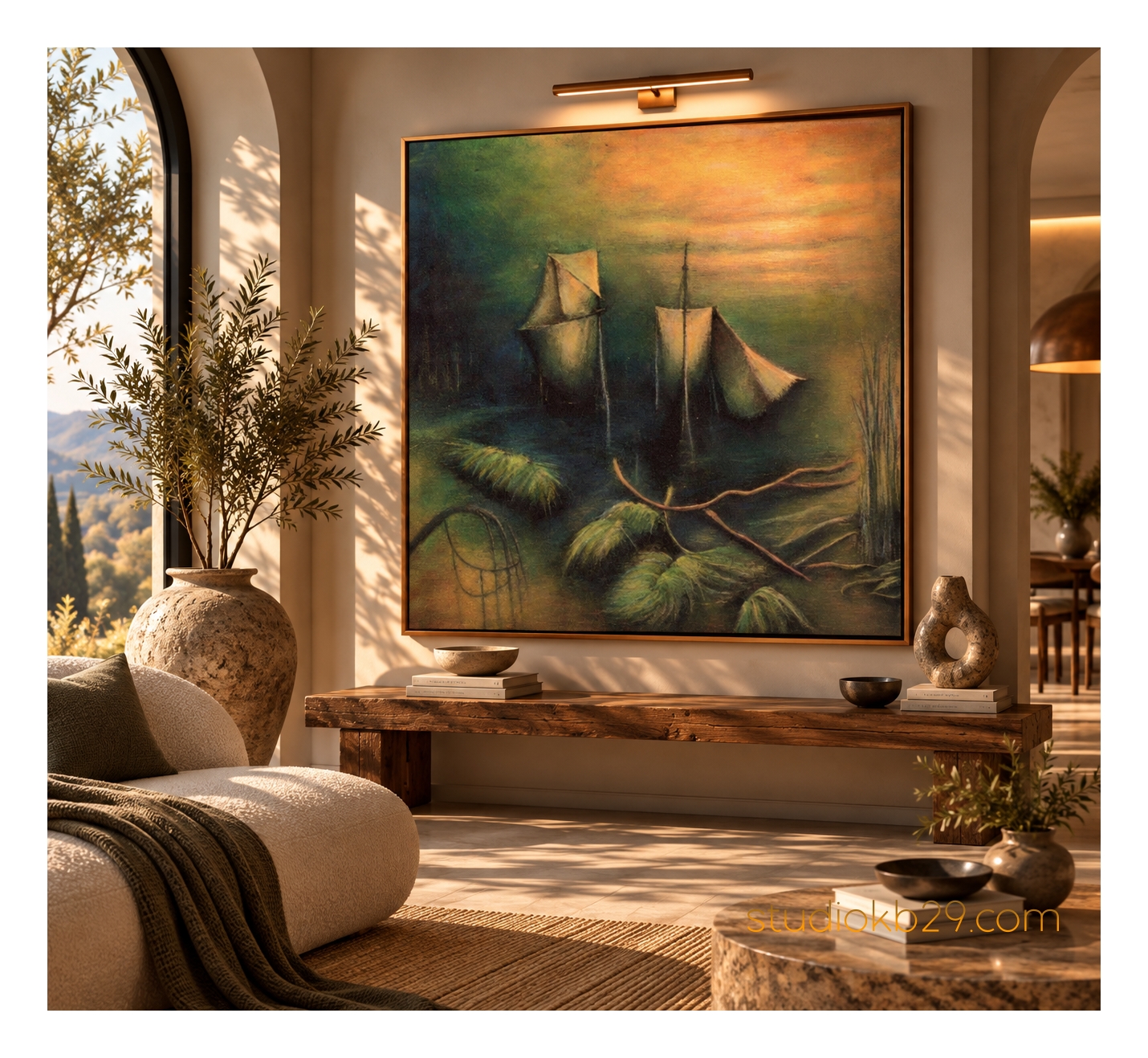
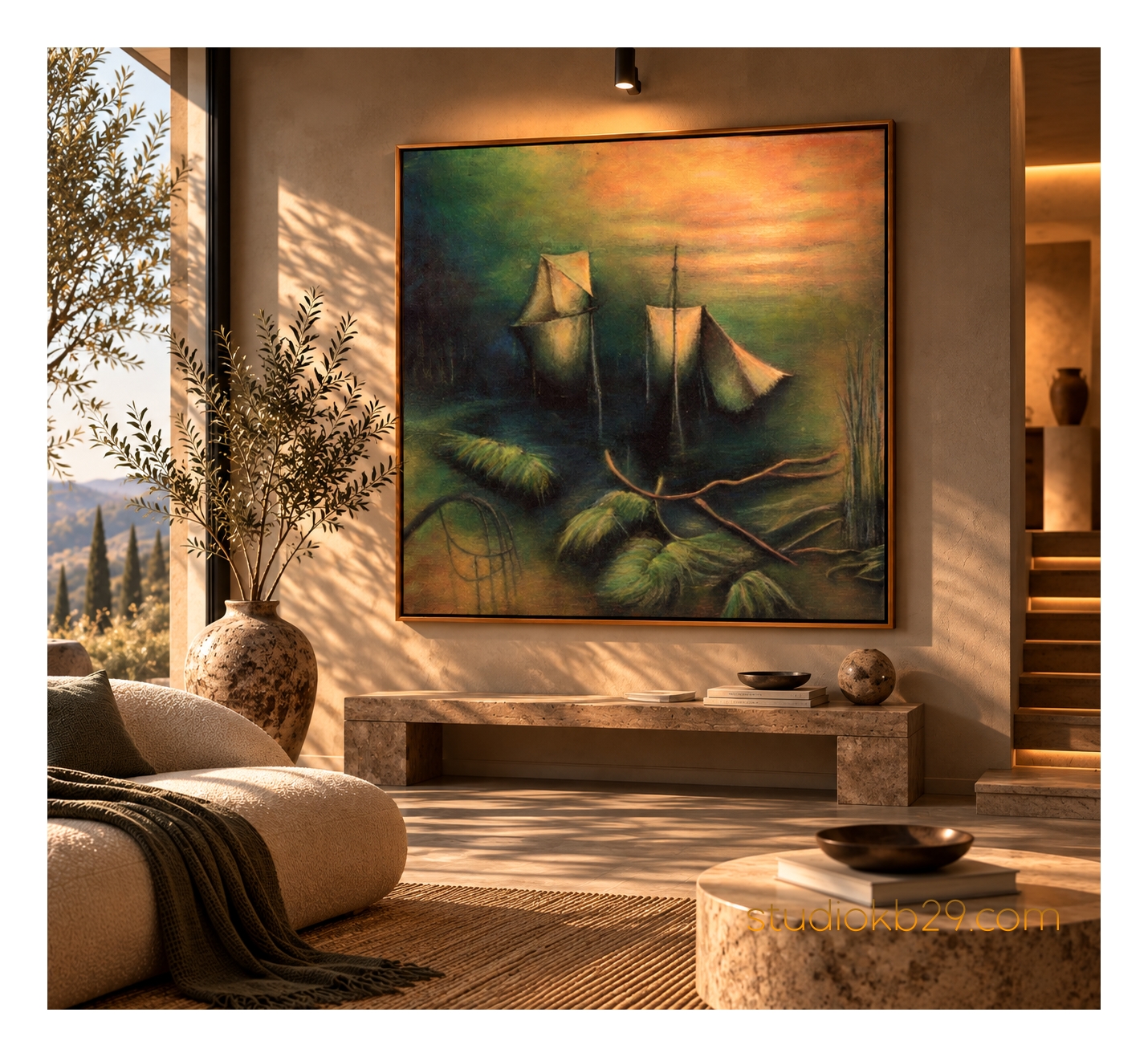
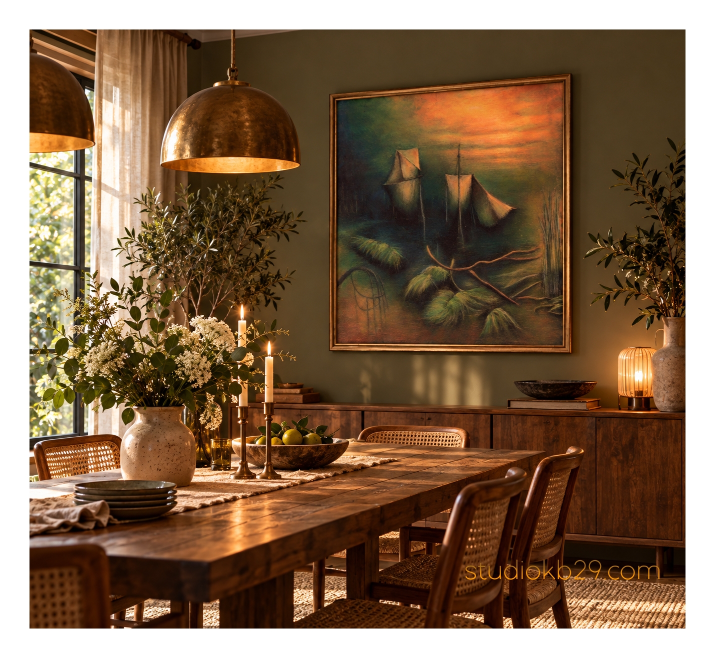
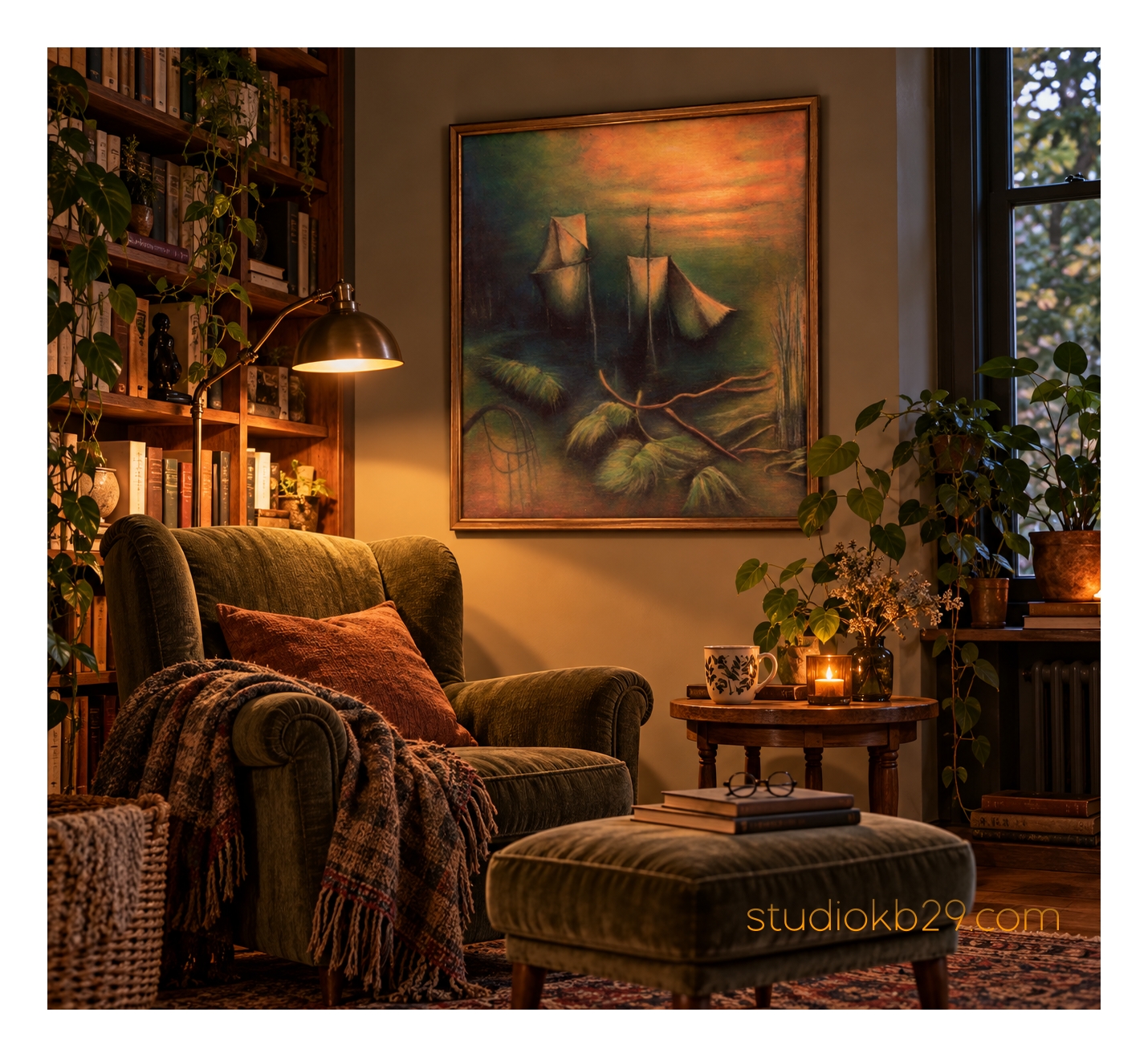
A world of uncertain horizons and unfamiliar forms unfolds in this atmospheric surreal artwork. Suspended between the suggestion of a distant seascape and the logic of an imagined dream, the composition evokes a place that feels strangely familiar yet impossible to locate.
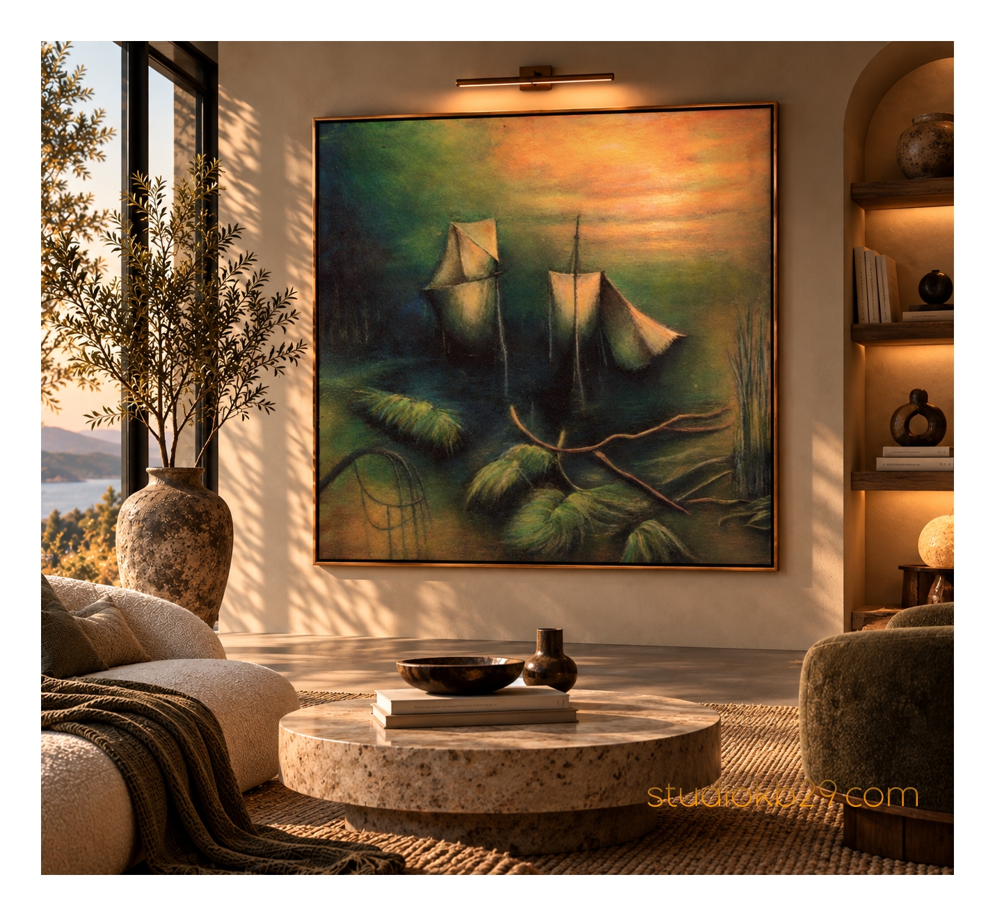
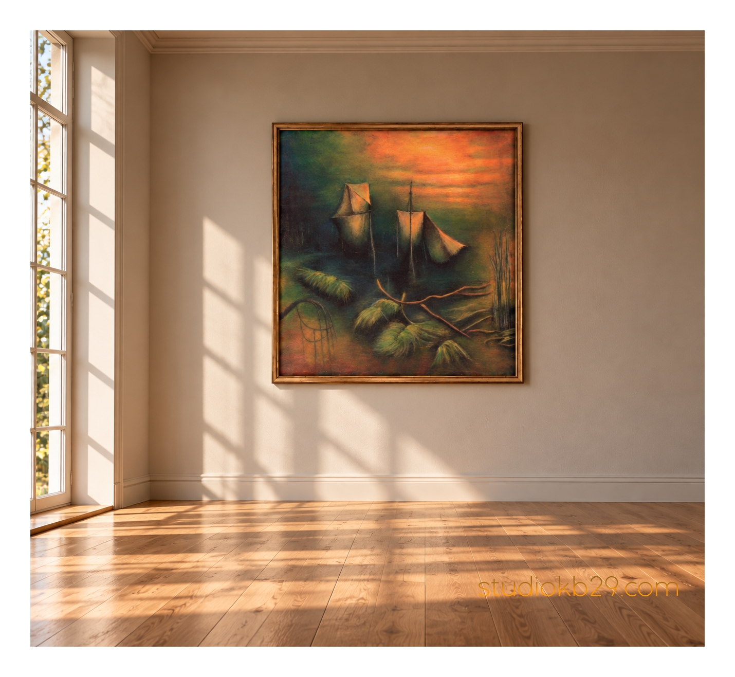
Across the middle distance, several enigmatic structures rise above a dark, tranquil expanse. Their angular silhouettes and pale, sail-like surfaces suggest vessels drifting through an unreal landscape, though their precise nature remains deliberately ambiguous. Slender vertical lines extend into the glowing sky, while the surrounding forms dissolve into shadow and atmosphere.
In the foreground, an entirely different language of shapes emerges. Curving, root-like structures stretch across the surface, interwoven with soft, clustered forms that appear to hover between vegetation, submerged objects and unfamiliar organic growth. Their contours evoke fragments of a world in transformation, where the boundaries between landscape, plant life and imagined architecture have become uncertain.
Above, a luminous sky unfolds in layers of warm orange, muted apricot and soft ochre. These glowing hues gradually merge into olive green and deep, shadowed tones, creating a subtle transition between atmosphere and landscape. The darker regions lend the composition depth and stillness, while the warmer passages introduce a quiet, almost otherworldly light.
Nothing in this scene is entirely fixed. The apparent horizon offers only a fleeting sense of orientation, and the familiar associations of sails, water and vegetation remain suspended between recognition and abstraction.
The result is a poetic vision of an imaginary place, inviting the viewer to explore a landscape shaped as much by suggestion and memory as by form itself.
Where Familiar Forms Become Unfamiliar
The central tension of the artwork lies in the transformation of recognisable shapes into something less definite.
The structures in the distance may initially evoke sails or vessels, yet they do not establish a conventional maritime narrative. Their simplified geometry, unusual placement and ambiguous relationship to the surrounding space give them an almost dreamlike presence.
Likewise, the forms in the foreground suggest roots, grasses or organic growth without representing any identifiable species. Their curved contours and soft, clustered volumes create a visual language that feels natural in its movement but imaginary in its construction.
These elements coexist without fully explaining one another. The scene seems to follow an internal logic that belongs neither entirely to the natural world nor to the built environment.
This ambiguity is central to the artwork’s surreal character. Familiar references offer the viewer a point of entry, while their transformation into unfamiliar forms keeps the composition open to interpretation.
The image becomes a meeting place between memory and imagination, where the suggestion of a landscape gradually gives way to a more personal and elusive visual experience.
The Quiet Drama of Light and Shadow
Light shapes the atmosphere of the composition as much as its forms.
The upper sky glows with warm orange and muted golden ochre, creating an impression of distant illumination. This warmth gradually recedes into darker green and brown tones, giving the image a sense of depth without establishing a clearly defined source of light.
The contrast between the luminous sky and the shadowed foreground creates a subtle visual journey. The eye moves from the open, expansive upper portion of the composition towards the dense and mysterious forms below.
The darker areas lend the artwork a sense of stillness, while the illuminated surfaces introduce a restrained emotional intensity. The resulting atmosphere is contemplative rather than dramatic, with an undercurrent of mystery that encourages prolonged observation.
There is a feeling of quiet suspension, as though the scene exists in the interval between arrival and departure, movement and stillness, recognition and uncertainty.
A Poetic Statement for Contemporary Interiors
With its atmospheric palette, unusual silhouettes and surreal spatial relationships, this artwork offers a distinctive alternative to conventional landscape art.
Rather than depicting a recognisable location, it creates an imagined environment that can be experienced in different ways. Its visual references are accessible, yet its overall meaning remains open, giving the work a depth that extends beyond its immediate appearance.
Particularly suited to:
- Contemporary residential interiors and statement walls
- Boutique hotels and design-led hospitality environments
- Private lounges, libraries and contemplative spaces
- Restaurants and intimate dining environments
- Creative studios, galleries and curated commercial interiors
- Interiors inspired by organic modernism, contemporary surrealism and expressive abstraction
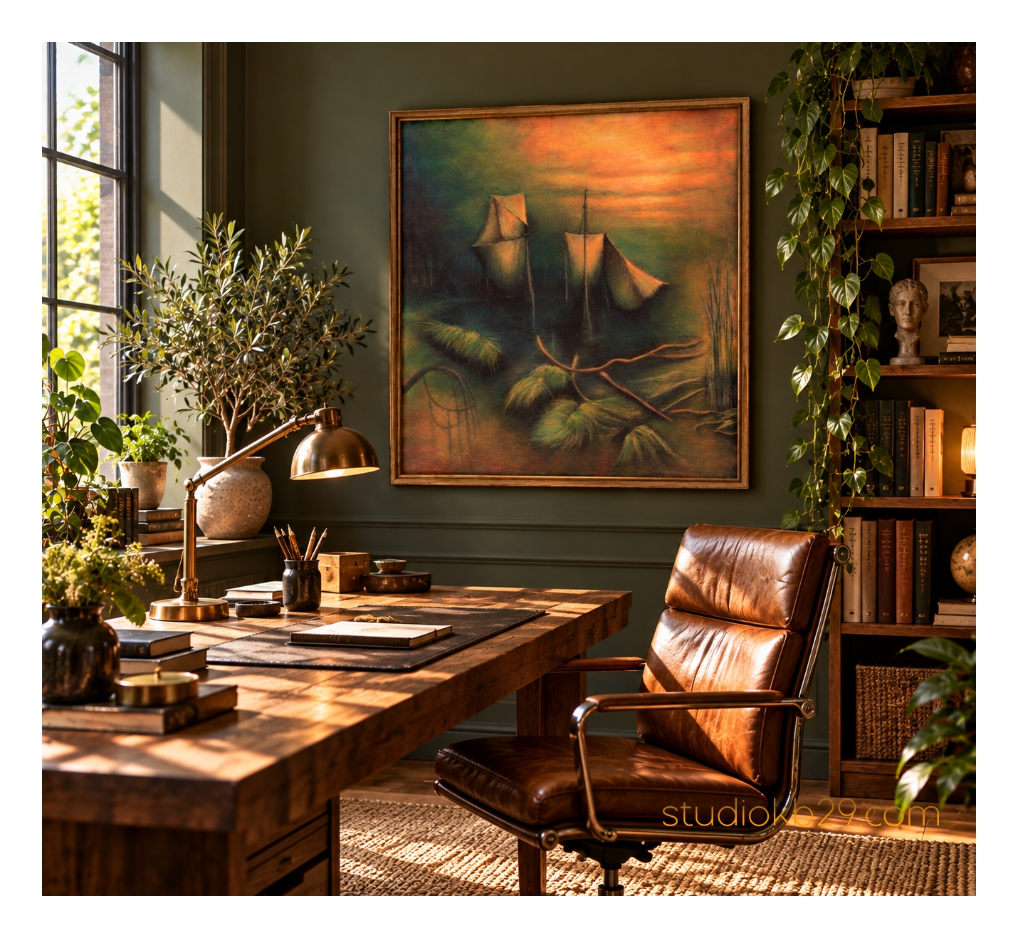
In restrained interiors, the artwork can introduce atmospheric colour and an intriguing focal point without overwhelming the surrounding architecture. Against warm neutral walls, the orange sky becomes a concentrated source of warmth, while the deep greens establish visual grounding.
In more layered environments, the composition can complement natural timber, textured plaster, muted green textiles and sculptural furniture. Its unusual forms also create an interesting counterpoint to clean architectural lines and contemporary materials.
For hospitality and commercial projects, the work offers the possibility of creating an individual visual identity through atmosphere rather than literal subject matter.
A Natural Palette of Muted Green and Warm Earth
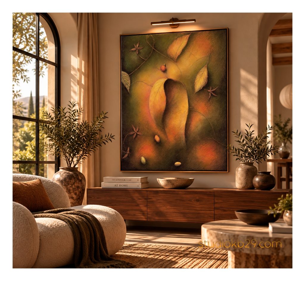
The composition is built around a nuanced palette of deep forest green, olive, muted teal, earthy brown, warm orange and soft ochre.
These naturalistic tones create a balance between warmth and coolness, openness and enclosure. The luminous sky introduces an inviting warmth, while the darker foreground establishes depth and visual stability.
Rather than relying on sharp contrasts, the artwork draws its richness from subtle tonal transitions and the interplay of illuminated and shadowed areas.
For a cohesive interior scheme, consider pairing the artwork with:
- Natural oak, walnut and other warm timber finishes
- Olive, moss-green and muted teal upholstery
- Warm ivory, sand and understated beige tones
- Terracotta and earthy brown accents
- Travertine, limestone and textured plaster
- Linen, wool and other tactile natural fabrics
- Dark bronze or black details for subtle architectural contrast
The artwork can act as a warm focal point in a neutral interior or become part of a more immersive palette of greens, earth tones and natural materials.
Its atmospheric quality makes it particularly suitable for spaces where colour, texture and visual calm are carefully balanced.
Between Imaginary Seascape and Organic Abstraction
The Shores of Elsewhere explores the possibility of a landscape that exists beyond familiar geography.
The distant structures suggest a maritime environment, while the foreground evokes an unfamiliar organic terrain. Neither element fully defines the scene. Instead, they coexist in a space where the distinctions between water, land, architecture and plant-like forms become fluid.
This uncertainty gives the artwork its imaginative depth. The viewer may perceive a dreamlike harbour, an alien shoreline or an abstract world assembled from fragments of remembered places.
Yet the composition does not require a specific interpretation. Its strength lies in the way it evokes the sensation of encountering somewhere unknown, a place that feels almost remembered despite having no identifiable origin.
For interior designers, this offers an artwork that introduces narrative and atmosphere without imposing a fixed story. It can complement nature-inspired schemes while remaining firmly rooted in surreal abstraction.
Multiple Print Materials. One Imaginary World.
Available in a selection of print materials, this surreal abstract composition can be adapted to different interior concepts and presentation preferences.
Canvas
A painterly presentation that complements the atmospheric transitions, soft tonal variations and dreamlike quality of the composition.
Metal
A contemporary option for modern interiors, architectural settings and design-led commercial environments.
Wood
A natural material choice that can complement the artwork’s earthy palette and organic visual language.
Acrylic
A sleek, contemporary presentation suited to interiors where a clean finish and modern material aesthetic are desired.
Paper
A classic art-print format offering flexibility through a choice of framing options. Particularly suitable for curated residential interiors, galleries and projects where the frame forms an integral part of the design.
Material availability and finishes may vary by selected format.
Framing to Complement Your Design Vision
The choice of frame can reinforce different aspects of the artwork’s character.
Natural wood creates a connection with the earthy palette and organic forms. Dark timber offers a more grounded presentation, while a slim black frame introduces a crisp contemporary edge that emphasises the composition’s unusual silhouettes.
Lighter wood and understated neutral finishes can create a softer transition between the artwork and its surroundings, particularly in interiors with warm walls, natural stone and tactile fabrics.
With a choice of framing options and frame styles, the presentation can be tailored to the aesthetic direction of individual projects, helping coordinate the artwork with furniture, lighting and architectural finishes.
Ready to Hang. Ready to Integrate.
Your selected artwork arrives ready to hang, helping simplify installation and the final stages of interior styling.
For interior designers, architects and project specifiers, this provides a practical way to incorporate the artwork into a complete design concept. The selected print material and framing can be coordinated with the surrounding furnishings, architectural details and wider material palette.
Whether specified for a private residence, boutique hotel, restaurant or creative commercial environment, the artwork can become an integral part of a carefully considered interior scheme.
From print material to frame selection, the presentation can be adapted to support the intended atmosphere and visual identity of the space.
The Shores of Elsewhere – A Journey into Imagined Space
The Shores of Elsewhere brings together enigmatic silhouettes, unfamiliar organic structures and an atmospheric palette of warm orange, muted ochre and deep green.
Its dreamlike spatial relationships evoke the suggestion of a distant shoreline without depicting a literal place. Forms reminiscent of sails emerge in the middle distance, while the foreground unfolds into a mysterious arrangement of curves and plant-like structures.
Poetic, contemplative and open to interpretation, the artwork invites the viewer to inhabit a world between memory and imagination.
Created for interiors that value individuality, atmosphere and artistic depth, it offers a distinctive expression of surreal abstract art.
An imagined landscape where distant forms drift between sky and water, organic shapes emerge from shadow, and the familiar gives way to the unknown.